You are using an out of date browser. It may not display this or other websites correctly.
You should upgrade or use an alternative browser.
You should upgrade or use an alternative browser.
Custom Printed Corks?
- Thread starter Boatboy24
- Start date

Help Support Winemaking Talk - Winemaking Forum:
This site may earn a commission from merchant affiliate
links, including eBay, Amazon, and others.
Boatboy24
No longer a newbie, but still clueless.
I like the top one. It reminds me more of a flowing river which I like. The wavier one looks like a piece of cloth or something. I think the waves would look better on the cork especially if it needs to be B/W.
Flowing river is what I'm going for. Broad Run is the stream that runs behind my house.
Jim, how did you create that artwork?
Microsoft Word.
I searched with the Google machine for "river illustration", "river clipart", etc. and those graphics were the best I found for what I had in mind. I just pasted the graphic into the Word doc and added text boxes above and below. Finally, I used the Windows snipping tool to copy the whole thing as an image.
Usually 300dpi for a sharp impression. They will shrink to fit.
- Joined
- Mar 1, 2009
- Messages
- 20,302
- Reaction score
- 2,223
I also like the first one best. I would search a bit more for river image as I don't get that out of either one.
That's a neat idea you have about applying the name twice in different directions. Even wineries don't worry about that as the corks go into a big hopper and they go in the way they land.
That's a neat idea you have about applying the name twice in different directions. Even wineries don't worry about that as the corks go into a big hopper and they go in the way they land.
tonyt
Senior Member
- Joined
- Aug 18, 2009
- Messages
- 2,872
- Reaction score
- 530
I didn't realize they were bi-disk type corks. That clinches it for me. I've been using bi-disk for a few years now, best of both worlds. I use about 300 number 9s per year. How long do yall think these will stay fresh if I repackage in 100s with the Food Saver?

$170.00 ($170.00 / Count)
Wine Ingredient Kit - CRU SELECT Australia Style Chardonnay
Hobby Homebrew

$99.00 ($99.00 / Count)
Wine Ingredient Kit - CRU SELECT Germany Style Riesling Traminer
Lucky 13 Trading

$175.50 ($175.50 / Count)
Wine Ingredient Kit - CRU SELECT Italian Style Sangiovese
Bridgeview Beer and Wine Supply

$129.00 ($129.00 / Count)
Cru International - Washington Merlot Style Wine Ingredient Kit
Hobby Homebrew

$155.96 ($155.96 / Count)
Winexpert Revelation Napa Cabernet Sauvignon 3 Gallon (Limited) Wine Ingredient Kit
Discount Hydroponics LLc

$22.99
$40.00
The Sommelier's Atlas of Taste: A Field Guide to the Great Wines of Europe
Amazon.com
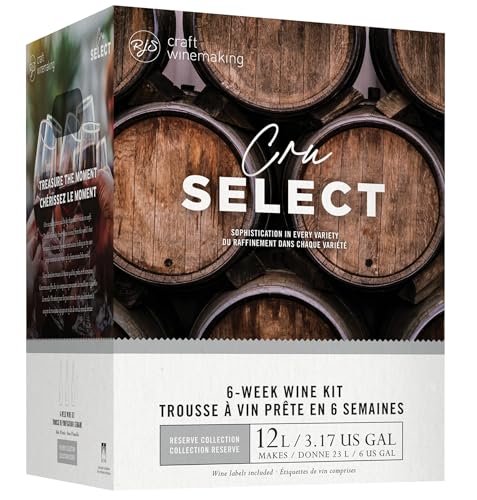
$175.50 ($175.50 / Count)
Wine Ingredient Kit - CRU SELECT Australia Style Viognier Pinot Gris
Bridgeview Beer and Wine Supply

$14.80
$24.00
The Geography of Wine: How Landscapes, Cultures, Terroir, and the Weather Make a Good Drop
Amazon.com
- Joined
- Jul 15, 2012
- Messages
- 3,743
- Reaction score
- 1,503
They will last for a couple years in a corkadore.
Boatboy24
No longer a newbie, but still clueless.
Thank you all! I really appreciate all the input. I continue my search for a graphic with the proper proportions that will induce thoughts of a flowing stream. Nothing better than what I've shown you already has been found. While I was strongly in favor of the 2nd design initially, I'm beginning to lean more toward the first now, due to it's simplicity. This has turned into a fun little project, and will likely have some influence on future label designs as well, since I'd have a logo of sorts.
Tony: I never thought about using the Foodsaver, but that is a great idea. I imagine they'd keep for a very long time once they're vaccum sealed.
Tony: I never thought about using the Foodsaver, but that is a great idea. I imagine they'd keep for a very long time once they're vaccum sealed.
- Joined
- Feb 9, 2010
- Messages
- 10,078
- Reaction score
- 5,983
There is nothing to tell. My cork supplier closed up shop. I now need a new cork supplier.Oh that just sounded too good to pass up JohnT. Do tell!
knockabout
Member
OK, played around a little over the weekend and looking for some opinions. Which design do you like more?
I think the top will print better, but I like the bottom one too.
Boatboy24
No longer a newbie, but still clueless.
Update:
After additional searching, I didn't find anything better that would be "printable" on the corks. So I went with the first design. I also had a stencil made of the logo from stencilsonline.com. I'll put that on my barrels, brute can/lid, fermenters, buckets, neighbors cat, etc.
Laffite was a pleasure to deal with and Nate was extremely helpful answering all my questions and providing some advice on helping me decide between the two designs.
I'll post up some pics when I have everything in hand. Thanks again for all your input.
Boatboy24
No longer a newbie, but still clueless.
That pic is where I got the idea!
LOL, thought so. I had them (online stencils) make me up a large stencil that says Le Petit Chai (the little barrel room) a while back. Painted it on the door to the Winery/Cellar. 

- Joined
- Feb 9, 2010
- Messages
- 10,078
- Reaction score
- 5,983
Seriously glowin,
What will it take to get you to change your avatar???
What will it take to get you to change your avatar???
Look into my Avatar…………..


Stickymatch
Member
- Joined
- Feb 1, 2014
- Messages
- 47
- Reaction score
- 13
Update:
After additional searching, I didn't find anything better that would be "printable" on the corks. So I went with the first design. I also had a stencil made of the logo from stencilsonline.com. I'll put that on my barrels, brute can/lid, fermenters, buckets, neighbors cat, etc.
Laffite was a pleasure to deal with and Nate was extremely helpful answering all my questions and providing some advice on helping me decide between the two designs.
I'll post up some pics when I have everything in hand. Thanks again for all your input.
Out of curiosity, what has been the response time from Laffite? I sent them an email on Thursday, using the sales email address on their site, and haven't received any response back.
Boatboy24
No longer a newbie, but still clueless.
Out of curiosity, what has been the response time from Laffite? I sent them an email on Thursday, using the sales email address on their site, and haven't received any response back.
I heard back on my initial inquiry within a couple hours. It may have been less than an hour, but I don't recall exactly. I do remember it was pretty quick.
Have you checked your junk/spam folder?
Stickymatch
Member
- Joined
- Feb 1, 2014
- Messages
- 47
- Reaction score
- 13
I heard back on my initial inquiry within a couple hours. It may have been less than an hour, but I don't recall exactly. I do remember it was pretty quick.
Have you checked your junk/spam folder?
Yep, no dice.
I just called them direct and asked for a sales person.
Similar threads
- Replies
- 9
- Views
- 954
- Replies
- 2
- Views
- 1K


![[Upgraded] 9Pcs Tree Root Growing Box with Drain Holes, Half Transparent Plant Rooting Propagation Ball & Metal Core Twist Ties, for Fast Propagation Plants (Size M)](https://m.media-amazon.com/images/I/514MWQxtWOL._SL500_.jpg)

