My new Logo, what do you think?

Winemaking Talk - Winemaking Forum

Help Support Winemaking Talk - Winemaking Forum:

This site may earn a commission from merchant affiliate links, including eBay, Amazon, and others.

NorCal

Super Moderator
Super Moderator
Joined
Apr 18, 2014
Messages
3,990
Reaction score
6,063
Location
Sierra Foothills, Nor Cal
I used a website called fiverr and the designed this logo for me: K & K Winery. Not bad for $5 and 5 days.

ec1326cc600f28a1455d21cafa049bfd.jpg
 
Wow, I love it. if you did it yourself I hope you're a graphic artist.
 
Norcal, I've managed to make my living as a Graphic Artist for the past 30 years AND I think it's a really well done logo. Clean, Interesting and Simple looking. Please understand that "Simple" is a compliment, it's sometimes one of hardest things to accomplish in a design. Your next task will be incorporating it into a balanced looking label successfully, look forward to seeing what you develop.
Mike
 
No graphics design background so take it with a grain of salt... It doesn't do it for me. I like a softer more flowing look. A more inviting and less threatening look.
 
Last edited:
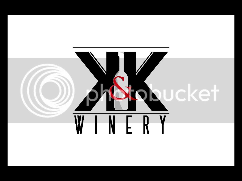
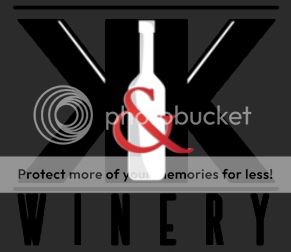
I think the logo concept is spot on. I really like the idea of the symmetric mirror image K's and the bottle in between. Those are great elements in a logo.

My personal tastes for logos get really really picky and I would do a few things just a little differently.

First, let me say that my idea of an ideal logo is one that is iconic and immediately recognizable whether it is 4 feet tall or half an inch high on a letterhead. I think your KK does that pretty well.

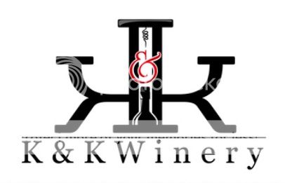
The other thing I like to see in a logo is it should be equally recognizable whether it is presented in color or in grayscale and complete B&W. On this point, I think the shaded areas of the bottle and the red ampersand become a little muddled and harder to recognize when rendered without color. I would rather have the bottle completely white inside to contrast the black K's without the shaded areas. It would be a more subtle bottle, but subtle makes some logos iconic (see FedEx subtle arrow in their logo, for example). It could be a good use of negative space. And if I'm being really really picky, I would make the bottle just a little taller so that there is some break between the black lines connecting the K's. Just enough so you see the slight curve of the bottom edges of the bottle, but not connected. I wonder how that would look and set off the K's.

Anyway, as I said, these are really small nitpicky things that I would have wanted a little different. But I am not a graphic artist. Others, I'm sure, would disagree and have other ideas. Regardless, it really is a hell of a nice logo and the price was definitely right!
 
Greg, are you sure you weren't an artist in another life, you gave a really observant critique and as you said, only really minor nitpicky kind of suggestions. I agree with losing the lines top and bottom of the bottle and maybe raising the shoulders of the bottle to better frame the ampersand. Being able to reproduce in Black and White is still a consideration but just not as much as it was even a few years ago. If I had to allow for that I think I'd shrink the ampersand to fit in the white bottle area. Dealing with keeping the ampersand clean and legible over the black and white areas of the Ks and bottle would be a challenge. Overall it's just not that much more expensive to print in color on just about anything.
Mike
 
Well, letters with logo letterhead get photocopied, if you want your logo to print say on a sales receipt thermal printer, etc. it would be in black and white and I would want it as recognizable as possible. I could think of a number of situations where the logo would be rendered intentionally or not in something other than full color.

I'd make the ampersand smaller too and fit it inside the white bottle.
 
It is a great design. It is one that would be very recognizable when sitting on a shelf next to others.
Mission accomplished.
Too many labels get caught up in numerous colors, designs, etc. While they are vibrant with color, they don't "stand out in the crowd".
 
Back
Top