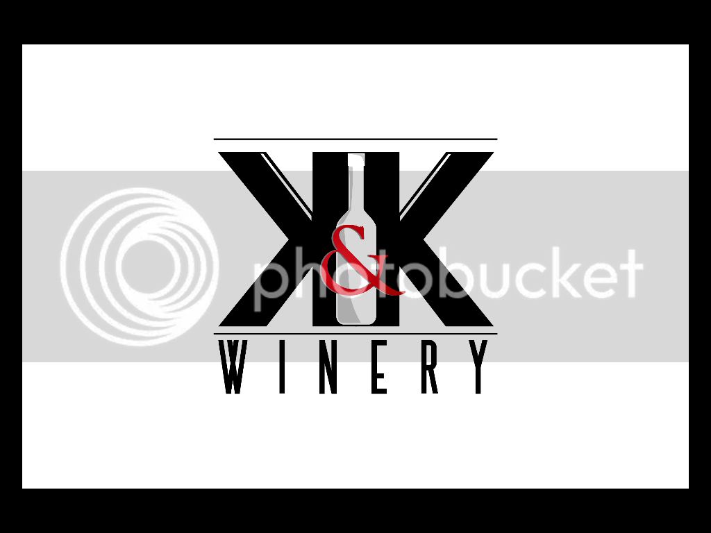
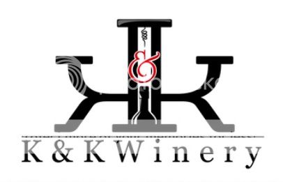
I think the logo concept is spot on. I really like the idea of the symmetric mirror image K's and the bottle in between. Those are great elements in a logo.
My personal tastes for logos get really really picky and I would do a few things just a little differently.
First, let me say that my idea of an ideal logo is one that is iconic and immediately recognizable whether it is 4 feet tall or half an inch high on a letterhead. I think your KK does that pretty well.
The other thing I like to see in a logo is it should be equally recognizable whether it is presented in color or in grayscale and complete B&W. On this point, I think the shaded areas of the bottle and the red ampersand become a little muddled and harder to recognize when rendered without color. I would rather have the bottle completely white inside to contrast the black K's without the shaded areas. It would be a more subtle bottle, but subtle makes some logos iconic (see FedEx subtle arrow in their logo, for example). It could be a good use of negative space. And if I'm being really really picky, I would make the bottle just a little taller so that there is some break between the black lines connecting the K's. Just enough so you see the slight curve of the bottom edges of the bottle, but not connected. I wonder how that would look and set off the K's.
Anyway, as I said, these are really small nitpicky things that I would have wanted a little different. But I am not a graphic artist. Others, I'm sure, would disagree and have other ideas. Regardless, it really is a hell of a nice logo and the price was definitely right!
