Geek, you forgot to mention this little one with the fluffy tail at the bottom of the picture. Probably feel bad all day now.Spending some time with old college friends from the 80s, nice Prosecco from Costco.
View attachment 84801View attachment 84802
You are using an out of date browser. It may not display this or other websites correctly.
You should upgrade or use an alternative browser.
You should upgrade or use an alternative browser.
Post a photo, any photo
- Thread starter MonteroRed
- Start date

Help Support Winemaking Talk - Winemaking Forum:
This site may earn a commission from merchant affiliate
links, including eBay, Amazon, and others.
- Joined
- Oct 23, 2014
- Messages
- 4,312
- Reaction score
- 5,819
you mean that aint the stripper?????????????Geek, you forgot to mention this little one with the fluffy tail at the bottom of the picture. Probably feel bad all day now.

Richard
jswordy
Senior Member
- Joined
- Jan 12, 2012
- Messages
- 11,069
- Reaction score
- 42,387
That's what the IT experts like to call a 'decoy button'.
It IS intuitive, though. (They like that word, too.)
This is from my iPhone
View attachment 84828
This shows up as an mp4.
Vic Frohmeyer
Pharma Engineer - Retired
Looks good, nice and clean! If you add a deep red into it somewhere or change the font or logo color to a red, a little contrast may move it away from the "headstoney" genre!I played around with labels today, more of the effort was on the 'brand' than the label. It looks a little headstoney to me..
Thoughts
View attachment 84813

$169.50 ($169.50 / Count)
Wine Ingredient Kit - CRU SELECT Australia Style Chardonnay
Bridgeview Beer and Wine Supply
$129.99 ($129.99 / Count)
$139.99 ($139.99 / Count)
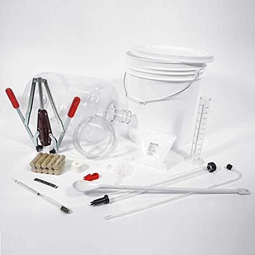
Wild Grapes Premium Wine Equipment Starter Kit - Wine Making Supplies - All-in-One Wine Kit for Crafting Wine at Home, 6 Gallon Fermenter Makes Up To 30 Bottles
Wild Grapes™
$6.99 ($0.35 / Count)
Red Supply Solution Wine Grape 20 Seeds - Vitis Vinifera, Organic Fresh Seeds Non GMO, Indoor/Outdoor Seed Planting for Home Garden
ORGINBUD LLC

$14.80
$24.00
The Geography of Wine: How Landscapes, Cultures, Terroir, and the Weather Make a Good Drop
Amazon.com
Are you using media with the headstone shape? If not, you're going to have a lot of white on the bottle. I suggest matching the media to the label, and consider cost. The media I was using doubled in price since Oct 2020, so I switched media.I played around with labels today, more of the effort was on the 'brand' than the label. It looks a little headstoney to me
View attachment 84813
Also consider how the label will look on the bottle. The black label may look very dark on a green bottle full of red wine. It's worth printing a sample and then checking first:

I'm not steering you towards lighter colors -- just cautioning you to experiment first. IMO @Vic Frohmeyer's suggestion of color is a good one. Keep the "branding" the same, but vary the font and color of the wine type. Make a few samples to check the differences.
Important -- with that much black on the background, do not print on an inkjet. It will not come out good. Use a color laser, or have it printed at Staples, Kinko's, or a similar place.
- Joined
- Oct 23, 2014
- Messages
- 4,312
- Reaction score
- 5,819
when them tiny little peas shoot up through your brain, i promise you,,,,, you will know what is said, and aw hell no, NO SHORTSheat wave?
View attachment 84867View attachment 84868
? good facial expression, , , can’t make out what he said
View attachment 84869View attachment 84870
going . . . going . . . gone . . . boy the water is warm compared to the air temp
View attachment 84871View attachment 84872
have wanted to do this on New Year’s Day for the polar bear club, , , ,
, , , maybe next year
heat wave?
View attachment 84867View attachment 84868
? good facial expression, , , can’t make out what he said
View attachment 84869View attachment 84870
going . . . going . . . gone . . . boy the water is warm compared to the air temp
View attachment 84871View attachment 84872
have wanted to do this on New Year’s Day for the polar bear club, , , ,
, , , maybe next year
I have done the polar bear plunge in Lake Michigan on Jan. 1 (a few years ago). I always get a laugh, because Jan 1 is one of the busiest days of the year on the beach in Milwaukee!
Looks good, nice and clean! If you add a deep red into it somewhere or change the font or logo color to a red, a little contrast may move it away from the "headstoney" genre!
It's growing on me. I tweaked it a bit and it works with other background colours. I tried adding red. I like it, but it might work better as an accent to enhance thelabel.
Original

Highlighting the bear ties it together for me. removing capitals from the wine softens it further.


I think it has potential.
Are you using media with the headstone shape? If not, you're going to have a lot of white on the bottle. I suggest matching the media to the label, and consider cost. The media I was using doubled in price since Oct 2020, so I switched media.
Also consider how the label will look on the bottle. The black label may look very dark on a green bottle full of red wine. It's worth printing a sample and then checking first:
View attachment 84890
View attachment 84891
I'm not steering you towards lighter colors -- just cautioning you to experiment first. IMO @Vic Frohmeyer's suggestion of color is a good one. Keep the "branding" the same, but vary the font and color of the wine type. Make a few samples to check the differences.
Important -- with that much black on the background, do not print on an inkjet. It will not come out good. Use a color laser, or have it printed at Staples, Kinko's, or a similar place.
I came up with this.

I'm really not too savvy on the design side, so after I got to this point I made the wine label in Avery full print label format, assuming I would buy the printable labels. $20 for 40. It's free to design to print to their precut labels. I'm sharing the printable download.
I like how it plays with other colours and templates, so the design is growing on me.
This is a little more balanced. Simple.

A little progress from the original. Again, more balanced, but I agree, I will likely have to work to get a good print.

Last edited:
I ended up putting the ABV and also the bottling month and year on mine, in small letters on the bottom.
I love the bearclaw! The colors definitely take away the headstone vibe. Good job!
I love the bearclaw! The colors definitely take away the headstone vibe. Good job!
Paw update.
A couple weeks back I posted a paw print in the snow that was almost 5 inches.
Got a couple game cams. These two show up every night between midnight and 6AM, usually about 20 minutes after deer. Big. Shoulder height is approximately 30 in. Looks like one might have a collar. Wolf-dogs are popular around here and we also have some wolf sanctuaries. Whatever they are and wherever they came from they're nocturnal and look well fed.
This is the best pic out of dozens.
And I'm missing some outdoor cats.

They look like pretty standard German Shepards to me. Maybe Shepard crosses. Someone needs to keep their pets controlled.Paw update.
A couple weeks back I posted a paw print in the snow that was almost 5 inches.
Got a couple game cams. These two show up every night between midnight and 6AM, usually about 20 minutes after deer. Big. Shoulder height is approximately 30 in. Looks like one might have a collar. Wolf-dogs are popular around here and we also have some wolf sanctuaries. Whatever they are and wherever they came from they're nocturnal and look well fed.
This is the best pic out of dozens.
And I'm missing some outdoor cats.
View attachment 84918
That was my first thought, too. Hard to tell for sure, though, with night vision pics.They look like pretty standard German Shepards to me. Maybe Shepard crosses. Someone needs to keep their pets controlled.
Everyone near me either has an outdoor pen or takes dogs inside because of the coyote problem. They could be from further away.
They do resemble pics of wolf-dogs I've seen. I'm hoping for a better daylight pic.
Ooh, gotta check my skeeter pee. I know a "watched wine doesn't clear" but I can't help myself.
Boatboy24
No longer a newbie, but still clueless.
Looks like you're headed north, with Fire Island in the distance.
I came up with this.
View attachment 84897
I really like this logo!
I suggest you do more with background color. At this time it probably doesn't matter, but when you have a dozen batches in the racks, quickly identifying wines becomes difficult if the labels all look too much alike. I have a page that displays the labels I have a record of:
https://wine.bkfazekas.com/bottle-label-progression/
Skip down to the 2012s and scan through to 2018. In hindsight, the labels have different text but all look alike. Finding things in the racks when you have a dozen batches and anywhere from a few bottles to a few cases of each wine, this can be difficult. I've switched to using a background image, which I fade out using Paint.NET, so each label has common features (winery name, my Grape Warrior logo + tag line OR my son's sword logo), bottling date, ABV), but everything else varies. It makes finding things easier. Plus I like designing labels.
I also have enough capsule colors for 7 or 8 batches, so in a year each batch gets a different color. I buy in lots of 500 so that it will be quite a while before I run out of a color in the middle of a batch.
Food for thought ....
Similar threads
- Replies
- 2
- Views
- 601
- Replies
- 16
- Views
- 1K
- Replies
- 1
- Views
- 647
- Replies
- 1
- Views
- 548


