You are using an out of date browser. It may not display this or other websites correctly.
You should upgrade or use an alternative browser.
You should upgrade or use an alternative browser.
Post your labels here
- Thread starter tonyt
- Start date

Help Support Winemaking Talk - Winemaking Forum:
This site may earn a commission from merchant affiliate
links, including eBay, Amazon, and others.
- Joined
- Jul 15, 2012
- Messages
- 3,743
- Reaction score
- 1,503
Huh? WHAT IS THAT?
I see. I think he is referring to Semenn.
I liked trying to decode them. I realized that the word that looks like "BNHO" is "vino" and the word that looks like "WATO" is "chateau." I did not make a lot more progress....
I liked trying to decode them. I realized that the word that looks like "BNHO" is "vino" and the word that looks like "WATO" is "chateau." I did not make a lot more progress....
Last edited:
NorCal
Senior Member

$213.50 ($213.50 / Count)
Wine Ingredient Kit - En Primeur Winery Series - South African Sauvignon Blanc
Bridgeview Beer and Wine Supply

$74.99 ($74.99 / Count)
Delirious Trembles Belgian Golden Strong Ale, Beer Making Extract Kit
Boomchugalug

$169.50 ($169.50 / Count)
Wine Ingredient Kit - CRU SELECT Australia Style Chardonnay
Bridgeview Beer and Wine Supply

$14.80
$24.00
The Geography of Wine: How Landscapes, Cultures, Terroir, and the Weather Make a Good Drop
Amazon.com
$6.99 ($0.35 / Count)
Red Supply Solution Wine Grape 20 Seeds - Vitis Vinifera, Organic Fresh Seeds Non GMO, Indoor/Outdoor Seed Planting for Home Garden
ORGINBUD LLC
balatonwine
The Verecund Vigneron
montanaWineGuy
Senior Member
- Joined
- Mar 31, 2015
- Messages
- 626
- Reaction score
- 368
montanaWineGuy
Senior Member
- Joined
- Mar 31, 2015
- Messages
- 626
- Reaction score
- 368
My first try (at wine and labels). I was somewhat limited by a b&w printer so I used a picture my son took when visiting the Brooklyn Bridge with his senior class last spring. Now that he sees it on my bottles, he feels like a "real photographer ".
Looks professional. Next year I want to do something like that. Mine is still very much cheap hobby label wine, which is appropriate for my "quality" of wine.
balatonwine
The Verecund Vigneron
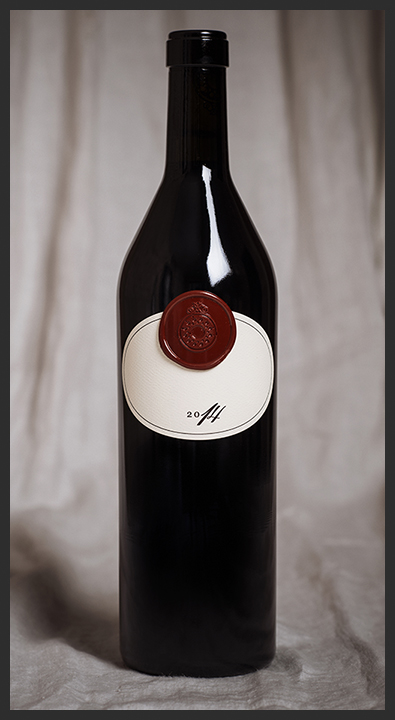
I personally love the Quaker like simplicity of Buccella Wine's label with nothing but the year (with the half "hand written" look) and a large wax seal. Posted for inspiration. Less is often more. 


Last edited:
dcbrown73
Clueless Winemaker
- Joined
- Mar 28, 2016
- Messages
- 1,221
- Reaction score
- 905
My first try (at wine and labels). I was somewhat limited by a b&w printer so I used a picture my son took when visiting the Brooklyn Bridge with his senior class last spring. Now that he sees it on my bottles, he feels like a "real photographer ".
View attachment 38070
I think the black and white look for that image / label gives it a simplistic elegance.
I say fantastic job!
Simpler is always better.
My first try (at wine and labels). I was somewhat limited by a b&w printer so I used a picture my son took when visiting the Brooklyn Bridge with his senior class last spring. Now that he sees it on my bottles, he feels like a "real photographer ".
View attachment 38070
Looks great!
4score
Member
- Joined
- Apr 25, 2013
- Messages
- 501
- Reaction score
- 513
The background is that we have several Rhone blends, one is a Syrah dominant one - The North. One is a Grenache dominant one - The South. One label has a demo istock background that would be purchased without water markings if we went with that one.
Probably 4. The imagery doesn't quite fit the play on words for the name though. Have you already looked at castles from the region?
Mike
Mike
Similar threads
- Replies
- 3
- Views
- 747
- Replies
- 12
- Views
- 1K


