You are using an out of date browser. It may not display this or other websites correctly.
You should upgrade or use an alternative browser.
You should upgrade or use an alternative browser.
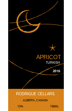
Post your labels here
- Thread starter tonyt
- Start date

Help Support Winemaking Talk - Winemaking Forum:
This site may earn a commission from merchant affiliate
links, including eBay, Amazon, and others.
Boatboy24
No longer a newbie, but still clueless.
Are those removable labels?
How much did you end up paying per label?
It's quantity based and not super cheap at low quantities. IIRC, for a batch of 30, it was close to $1/per.
It's quantity based and not super cheap at low quantities. IIRC, for a batch of 30, it was close to $1/per.


I am seeing $1.25 ea at a quantity of 30!
Drops nicely however to $0.55 if you order…….
6000
Drops nicely however to $0.55 if you order…….
6000
It's quantity based and not super cheap at low quantities. IIRC, for a batch of 30, it was close to $1/per.
$6.99 ($0.35 / Count)
Red Supply Solution Wine Grape 20 Seeds - Vitis Vinifera, Organic Fresh Seeds Non GMO, Indoor/Outdoor Seed Planting for Home Garden
ORGINBUD LLC

$213.50 ($213.50 / Count)
Wine Ingredient Kit - En Primeur Winery Series - South African Sauvignon Blanc
Bridgeview Beer and Wine Supply

$169.50 ($169.50 / Count)
Wine Ingredient Kit - CRU SELECT Australia Style Chardonnay
Bridgeview Beer and Wine Supply

$14.80
$24.00
The Geography of Wine: How Landscapes, Cultures, Terroir, and the Weather Make a Good Drop
Amazon.com

$74.99 ($74.99 / Count)
Delirious Trembles Belgian Golden Strong Ale, Beer Making Extract Kit
Boomchugalug
TemperanceOwl
Member
- Joined
- Oct 30, 2014
- Messages
- 209
- Reaction score
- 72
My Christmas Spiced Dragon BloodView attachment 25950
Nice, JSquared! Very festive.
TemperanceOwl
Member
- Joined
- Oct 30, 2014
- Messages
- 209
- Reaction score
- 72
TemperanceOwl
Member
- Joined
- Oct 30, 2014
- Messages
- 209
- Reaction score
- 72
- Joined
- Mar 1, 2009
- Messages
- 20,302
- Reaction score
- 2,223
Very nice labels. Did you design the word Pyment or is that a down loaded font. I find it a bit hard to read.
TemperanceOwl
Member
- Joined
- Oct 30, 2014
- Messages
- 209
- Reaction score
- 72
Very nice labels. Did you design the word Pyment or is that a down loaded font. I find it a bit hard to read.
Thanks, Dan! I did design the whole thing, including the word Pyment made out of honeycombs. I agree it's a little hard to read, but didn't know how to improve it and keep the honeycombs. I kind of figured that with the suggestion of the word at the top, and the description of the drink (which is kind of the definition of pyment) people would make the connection. Thanks for the feedback!
- Joined
- Mar 1, 2009
- Messages
- 20,302
- Reaction score
- 2,223
I see, I did not read what the wine was and didn't make the honeycomb connection. Very nice. Again great job on the design.
TemperanceOwl
Member
- Joined
- Oct 30, 2014
- Messages
- 209
- Reaction score
- 72
Very nice, Geek! I especially like the Moscato ones. Colorful!
Boatboy24
No longer a newbie, but still clueless.
Nice labels, Varis. But I especially like the way the wood grain in the table plays with the Chardonnay, making it look almost like a lava lamp.
Noontime
Custom Label Printing & Design
- Joined
- Oct 7, 2007
- Messages
- 747
- Reaction score
- 457
Great design! A slight tweak could make it a little easier to read, by visually separating the letters. Just like you have between the M and the E, if you make the lines between all your letters a little darker it might help. It doesn't even need to be drastic, just a bit of contrast would probably do it. Or you could separate them completely (but still have them overlap), by putting a shadow on each letter; making each one a separate chunk of honeycomb. Or you can leave it like it is because it's great.Thanks, Dan! I did design the whole thing, including the word Pyment made out of honeycombs. I agree it's a little hard to read, but didn't know how to improve it and keep the honeycombs. I kind of figured that with the suggestion of the word at the top, and the description of the drink (which is kind of the definition of pyment) people would make the connection. Thanks for the feedback!

TemperanceOwl
Member
- Joined
- Oct 30, 2014
- Messages
- 209
- Reaction score
- 72
Great design! A slight tweak could make it a little easier to read, by visually separating the letters. Just like you have between the M and the E, if you make the lines between all your letters a little darker it might help. It doesn't even need to be drastic, just a bit of contrast would probably do it. Or you could separate them completely (but still have them overlap), by putting a shadow on each letter; making each one a separate chunk of honeycomb. Or you can leave it like it is because it's great.
Thanks, David!!
HeadWatersWine
Member
- Joined
- Dec 15, 2014
- Messages
- 50
- Reaction score
- 48
Similar threads
- Replies
- 3
- Views
- 754
- Replies
- 12
- Views
- 1K


