You are using an out of date browser. It may not display this or other websites correctly.
You should upgrade or use an alternative browser.
You should upgrade or use an alternative browser.
Post your labels here
- Thread starter tonyt
- Start date

Help Support Winemaking Talk - Winemaking Forum:
This site may earn a commission from merchant affiliate
links, including eBay, Amazon, and others.
Noontime
Custom Label Printing & Design
- Joined
- Oct 7, 2007
- Messages
- 747
- Reaction score
- 457
Very nice label PittGrad. Texture on the label stock is elegant, and I love that you didn't feel the need to fill the sky; all that empty space adds to the design. Great job.Skyline on the bottom a homage to the city I love!
(Incidentally, if you want a very decent quick drinking dry white, don't look past this WE World Vineyard Sauv Blanc!!)
Noontime
Custom Label Printing & Design
- Joined
- Oct 7, 2007
- Messages
- 747
- Reaction score
- 457
Got some plums back in 2014 from a friend.Bottled it the other day.Figured I'd keep the label simple
Really nice clean, but rustic look; like classic fruit crate art. If you wanted to go the extra mile on special gifts or special wines, you could cut the plums out with an Xacto knife so the bottle shows through (I know probably more work than it's worth, but just an idea).

Boatboy24
No longer a newbie, but still clueless.
Boatboy24
No longer a newbie, but still clueless.
nice label Jim.
Stoney Creek!
My wines are getting better, so I'm classing them up with some 'real' labels.


$169.50 ($169.50 / Count)
Wine Ingredient Kit - CRU SELECT Australia Style Chardonnay
Bridgeview Beer and Wine Supply

$213.50 ($213.50 / Count)
Wine Ingredient Kit - En Primeur Winery Series - South African Sauvignon Blanc
Bridgeview Beer and Wine Supply

$14.80
$24.00
The Geography of Wine: How Landscapes, Cultures, Terroir, and the Weather Make a Good Drop
Amazon.com
$6.99 ($0.35 / Count)
Red Supply Solution Wine Grape 20 Seeds - Vitis Vinifera, Organic Fresh Seeds Non GMO, Indoor/Outdoor Seed Planting for Home Garden
ORGINBUD LLC
$136.48
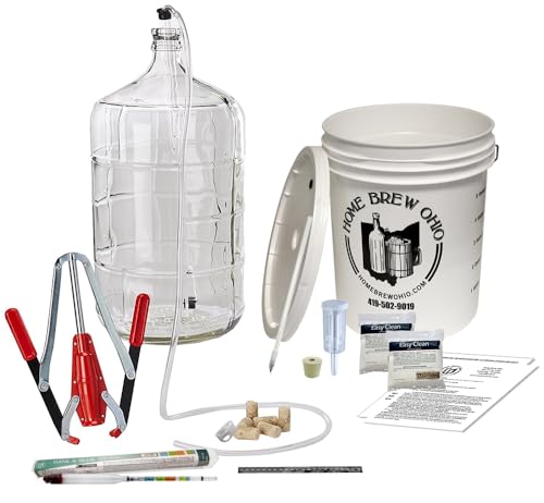
Winemakers Depot BT-IIWK-VISS Premium Wine Making Equipment Kit - with Auto-Syphon
Home Brew Ohio

$74.99 ($74.99 / Count)
Delirious Trembles Belgian Golden Strong Ale, Beer Making Extract Kit
Boomchugalug
vernsgal
Just me
- Joined
- Oct 24, 2012
- Messages
- 2,115
- Reaction score
- 1,219
Bottling 11 gallons this weekend.
wow 14.9% alc! was this a kit wine?
Boatboy24
No longer a newbie, but still clueless.
Nope. From fresh grapes. And that 14.9 is after I diluted with acidulated water! 


Nope. From fresh grapes. And that 14.9 is after I diluted with acidulated water!
Lucky you, at least your experience told you to dilute in time. My Pinot Noir batch got 15.3% this year before I knew it, so I may consider using it for disinfection when I run out of rubbing alcohol.

Boatboy24
No longer a newbie, but still clueless.
Lucky you, at least your experience told you to dilute in time. My Pinot Noir batch got 15.3% this year before I knew it, so I may consider using it for disinfection when I run out of rubbing alcohol.
This is an invaluable resource. Even though I've got the basics down now, I still re-read it before each harvest. I've got it printed out and in the winery.
http://www.morewinemaking.com/public/pdf/wredw.pdf
laceyogden
Junior
- Joined
- Feb 4, 2016
- Messages
- 15
- Reaction score
- 9
Noontime
Custom Label Printing & Design
- Joined
- Oct 7, 2007
- Messages
- 747
- Reaction score
- 457
Very nice! Is that your family coat of arms?I spent only a few mins doing this but love how it turned out for our first!
laceyogden
Junior
- Joined
- Feb 4, 2016
- Messages
- 15
- Reaction score
- 9
Yes, it sure is! And Oak Valley is what "Ogden" means.
Boatboy24
No longer a newbie, but still clueless.
Very nice, @4score . I recognize the Zin template. Did you do the Rose from Stoney Creek as well?
Last edited:
4score
Member
- Joined
- Apr 25, 2013
- Messages
- 501
- Reaction score
- 513
Very nice, @4score . I recognize the Zin template. Did you do the Rose from Stoney Creek as well?
Hi. Yes, I started there. I remember seeing yours and I was REALLY impressed! So I tried to create one from scratch on Photoshop. Had to find my own "grunge" background and play around with the tint and contrast. Couldn't find the same font so I used something a bit different. Fun project. Thanks.
Similar threads
- Replies
- 3
- Views
- 752
- Replies
- 12
- Views
- 1K


