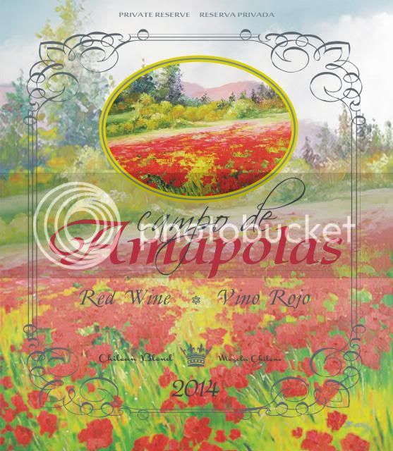
Post your labels here

Winemaking Talk - Winemaking Forum

Help Support Winemaking Talk - Winemaking Forum:

This site may earn a commission from merchant affiliate links, including eBay, Amazon, and others.
I like the label but love the backstory that goes along with it. it makes it special and unique and a story to tell to all you share it with! cheers
 
Nice labels Tony.

Can you tell us a little more about your Valpolicella Ripasso? Was that a kit? I tried one in the fall using a Valpolicella bucket from Italy and some raisins in both primary and secondary in hopes of attaining some form of raisin-y flavor that you get from the Ripasso. Obviously, the jury is still out on that one.
 
Can you tell us a little more about your Valpolicella Ripasso? Was that a kit?

Yes it's a kit. I do the Valpolicella Ripassa, RJS Cru Select once per year. It took Silver in the Missouri Competition recently. I usually add a pound of raisins in primary along with some FT Rouge and American oak dust.
 
Thanks so much Toddo! I'm in Ontario so I have access to the lcbo! It looks like good wine! Love the bottles! Have to get my hands on some!

Rayway your labels are great too!


Carolyn


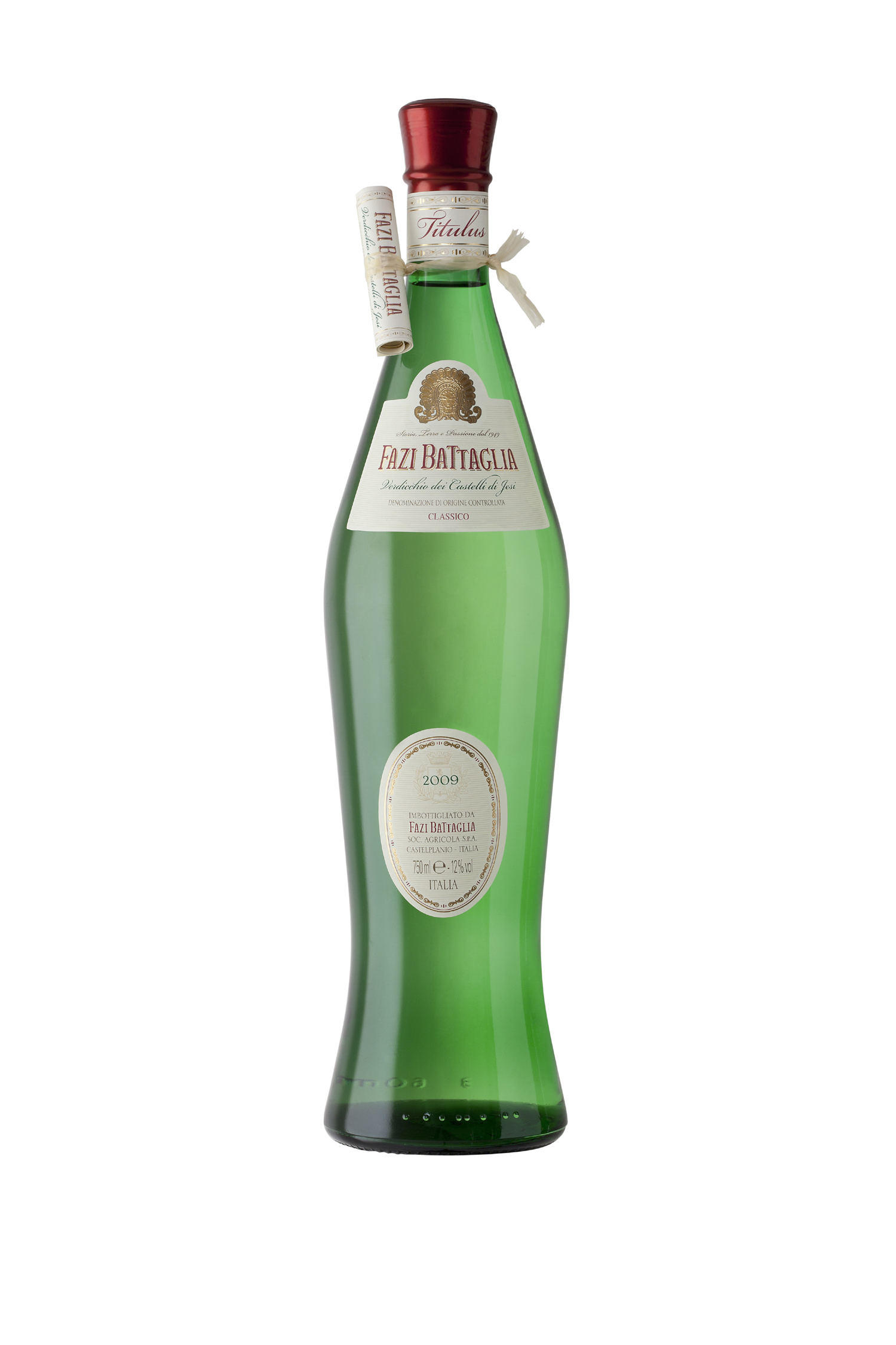
Just picked up my first one of these today! Very nice bottles! I'll try to pick one up per week to begin collecting them!
 
The curvy bottles are the brand "FAZI BATTAGLIA" available at my local LCBOs http://lcbo.com/lcbo-ear/lcbo/product/details.do?language=EN&itemNumber=24422


Campari.jpg


Sorry I meant to quote this post not the other one. These bottles are even nicer in person!
 
Redesigned Back Label

Ok so I decided to redesign the Merlot back label
I had created a while back
Tell me what you really think :p

Dark Harvest.jpg
 
Looking much better. A few nitpicks:

-It looks like spaces are missing after many commas, such as "Plums,Blackberries"
-I personally prefer the Oxford (or Harvard) comma, which would mean you would have one after "Blackberries." I understand that reasonable people may disagree.
- Why is "Wine" capitalized in the second sentence? (For that matter, why are Plums, Blackberries, and Cherries capitalized? But those look fairly natural, whereas "Wine" looks Germanic.)
-Looks like you are missing a space after "meal"
-"every day" should be "everyday."
-I believe that "Surgeon General" should be capitalized: it is a singular title.
-Looks like you are missing a space after (2)
 
Personally I love the antique look of the label paper. In the old old days punctuation was up to the printer, and some wildly variable choices were made. Anyway, while I agree with Paul Sourgrapes comments, I feel that overall they match the spirit of the label.

Pam in cinti
 
Forgot to mention. I've never seen the shellfish derivative comment on a label before. But as someone who is really allergic, I thought it was a great idea. I make a lot of bread and have to be careful when I use peanut oil. I don't always think to mention it, and it makes a difference in some breads I make. Having a label that states it is really a safety issue, covering both the health of the drinker and your wallet in case of lawsuit.

Pam in cinti
 
I think it is an attractive and creative label.

If you are going to use this eventually as a commercial label for a licensed taxed product, I think the TTB will not like the gov warning to be obscured by the art underneath it. I think it has to be clear and easily readable.

Also, no need for a shellfish warning as you can't use shellfish derived chitosan commercially. I think you can only use chitosan from fungal origins.


Sent from my iPad using Wine Making

I agree with what Greg said. Otherwise it;s a great label for homemade wine. Just glancing at the label and not reading what it says I could picture this on a whiskey bottle.
 
Ok so I decided to redesign the Merlot back label
I had created a while back
Tell me what you really think :p

It's a good looking label, and I can't wait to see the front. I agree with the person who mentioned the warning text...you will probably have to make that black text to meet TTB requirements, and also Government Warning needs to in bold.

From a design perspective, there are a few little things that jump out at me. First, there is A LOT going on visually. It seems congested by the amount of stuff on there, which isn't helped by the even spacing between all the blocks of text (and the large amount of wasted space on all sides).

The stroke around 2014 makes it stand out more than the other text, and in addition to it being in the center of the label makes it the first thing I see. The "visual hierarchy" has me jumping all over the label from the center to the top, to the floating elements (bar code, sample, barrels). You could have one or two of those overlap the leafy side bars, without taking away from them aesthetically.

There also may be too many different fonts used (or effects on them). All 9 blocks of text are different in style, so including the "sample" text there are 10 different looking text characters.
 
Well were getting closer

I will look into all the comments and adjust
It is funny how you miss all of those little things
until another set of eyes look at it
Thanks for the input
Be back soon
 
Just started a Skittles and Starburst wine and thought I'd give the whole labeling thing a go. It's a fun label for a fun wine. Anyone any thoughts on printing? I ordered some general use A4 stcker paper and it seems fine but if there's anything better out there I'd love to know.

skittles label.jpg
 
Back
Top