Post your labels here

Winemaking Talk - Winemaking Forum

Help Support Winemaking Talk - Winemaking Forum:

This site may earn a commission from merchant affiliate links, including eBay, Amazon, and others.
Very nice, David. I like both a lot. If using a clear bottle, I'd prefer the black background (with a black foil capsule). Otherwise, I think I'm neutral.
 
As others have said...the creativity on this forum is really amazing. So many great labels (and the creativity is reflected in great recipes as well).
Here are my latest designs...kind of a 19th century classic label design. I can't decide which I like better, the black or white.
Great job, I say keep both, they will both suit different bottles. When I was scrolling down this thread the black one looked like a Jack Daniels Label, had to take a double look!

Just started an experiment with a few different bits n pieces I had in the kitchen and thought Id get ahead of myself with a label for it. Just wondering if many of you put a back label on your bottles?

Angels Tears.jpg
 
Too many labels to comment on lately but wow! You're all so talented! I love reading this thread!
 
Great job, I say keep both, they will both suit different bottles. When I was scrolling down this thread the black one looked like a Jack Daniels Label, had to take a double look!
Ha! You're right. Funny how a design with nothing in common but black background and white text can look so familiar. I'm sure there are plenty of other products out there too...it's a classic design style. Both will definitely be kept on the website.:b
 
Very cool, Kim. Keep up the effort. They'll always see the label before they taste the wine. Expectation is everything...apparently.

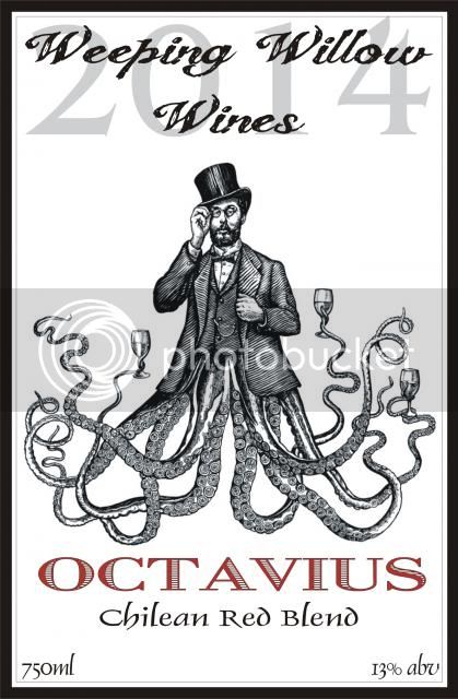
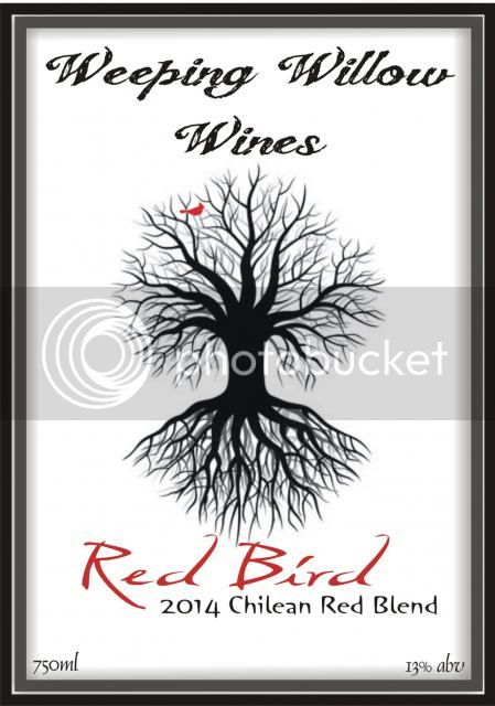
A couple more for my as-yet-to-be-determined Chilean blends. After I make my targeted blends, the rest will be mixed somewhat haphazardly. Need labels none-the-less...

OCTAVIUS.jpg


Red_Bird.jpg
 
Love the red bird! Then again I have a love for the tree of life and barren deciduous trees. I know, weird.
 
Weird? Not at all, Gina. I once owned a house, high on a ridge line covered with forest. There was a 400+ acre tract right next to my property owned by the forest industry. Beautiful stands of big deciduous trees. In the winter, I would bundle up and walk for hours through those woods, far more than I ever did in the summer. Something about the silence, and the contrast of the snow with the tall dark trunks of the barren trees spoke to me.

I miss that place.
 
I made plum wine this year and made this label in powerpoint and ordered the labels from VistaPrint.:ib
14625d1395687026-post-your-labels-here-new-picture.png

2nd try on putting some criticism into this thread:
- too many fonts, font colors, font styles and font sizes
- too harsh contrasts
- unbalanced graphical elements

Try to "streamline" the label, use less fonts, less colors, less harsh contrasts, arrange the elements in a more balanced way and it could look way different:


Please don't get this wrong, I don't want to offend you, just want to push you into the right direction :b
 
I have just started wine making last year and so far bottled a few batches of SP variants. I print them off my home printer on Avery 5453 labels 3"x4". They are easy to take off the empties so that I can reuse the bottles. I am cheap :mny
The DB had some grape from my vine in it. The Gorilla Juice had a case of bananas in with the Real Lemon. The Kiss is just Lemon and the Leprechaun wine was lemon with honeydew and colored green.
14630d1395717322-post-your-labels-here-db-good.jpg

14631d1395717322-post-your-labels-here-good-gj.jpg

14632d1395717322-post-your-labels-here-lk_good.jpg

http://cdn.winemakingtalk.com/forum...95717322-post-your-labels-here-good-label.jpg

Similar problems here.
Plus some very typical errors for people who are new into graphic design:

- italic letters:
Don't use them all over the place. Italic letters are usually used to emphasize something or to quote something. It loses its effect when used all over the place and makes the whole caption look "uneasy".
If you want your captions to look more "dynamic" you might use a handwriting-style font or you might even find out that a "normal" font is not that bad after all.

- customized fonts:
Typographers spent hours if not months on the creation of a font and it looks the way it looks for good reason. If you start to change it you will definitely not improve it. If you don't like the look of the font, use another font instead! There are thousands of free fonts on the net!
Typical customizations are: thick outlines, 3d-Effects, scaling the proportions etc.

- Text competing with pictures:
Beginners very often try to compete a "catchy" image with extravagant captions. That makes the label look overloaded. Don't compete the images, complete them! Less is more!

- Text on pictures
This hardly ever works. Most of the time you will find it hard to read the text. Better place the text on a one-colored background!

- unbalanced colors:
You probably try to find matching colors when you dress up. Do the same, when you create graphics! There are color wheels that help you to find colors that match. Check out kuler.adobe.com or similar pages!

- low res pictures:
Most beginners just use graphics they found on the net. There's one big problems: Internet graphics are very often small and highly compressed.
Most printers print 300dots per inch, so you should use graphics with at least 300 pixels per inch if you want a good printing result. But still a high res picture might come out in bad quality if its compression is too high. Vector graphics don't come with these problems and you will also find millions of them on the net!
 
Last edited:
Ok so I decided to redesign the Merlot back label
I had created a while back
Tell me what you really think :p
http://cdn.winemakingtalk.com/forum...993248-post-your-labels-here-dark-harvest.jpg
Forgive my nitpicking , but I'm a bit in the mood of criticising ;)

First of all I like the vintage look, the patterns and the barrels.

But: Then you use texts with transparent shadow effects. I doubt that these effects existed back in the old days and it breaks with the vintage look!

You also use far too many different fonts for my taste: I count 8 fonts. or is it even 9? and a lot of different colors and effects and sizes. I think if you reduced the number of fonts to 3 or 4 it would improve the overall look of your label significantly.
 

Latest posts

Back
Top